Brand Guidelines
brand
Guidelines for using DEEL brand assests in various applications
Web, print and email resources
Brand Guidelines
brand
Guidelines for using DEEL brand assests in various applications
Web, print and email resources
Brand Guidelines
brand
Guidelines for using DEEL brand assests in various applications
Web, print and email resources
DEEL Logo & Usage
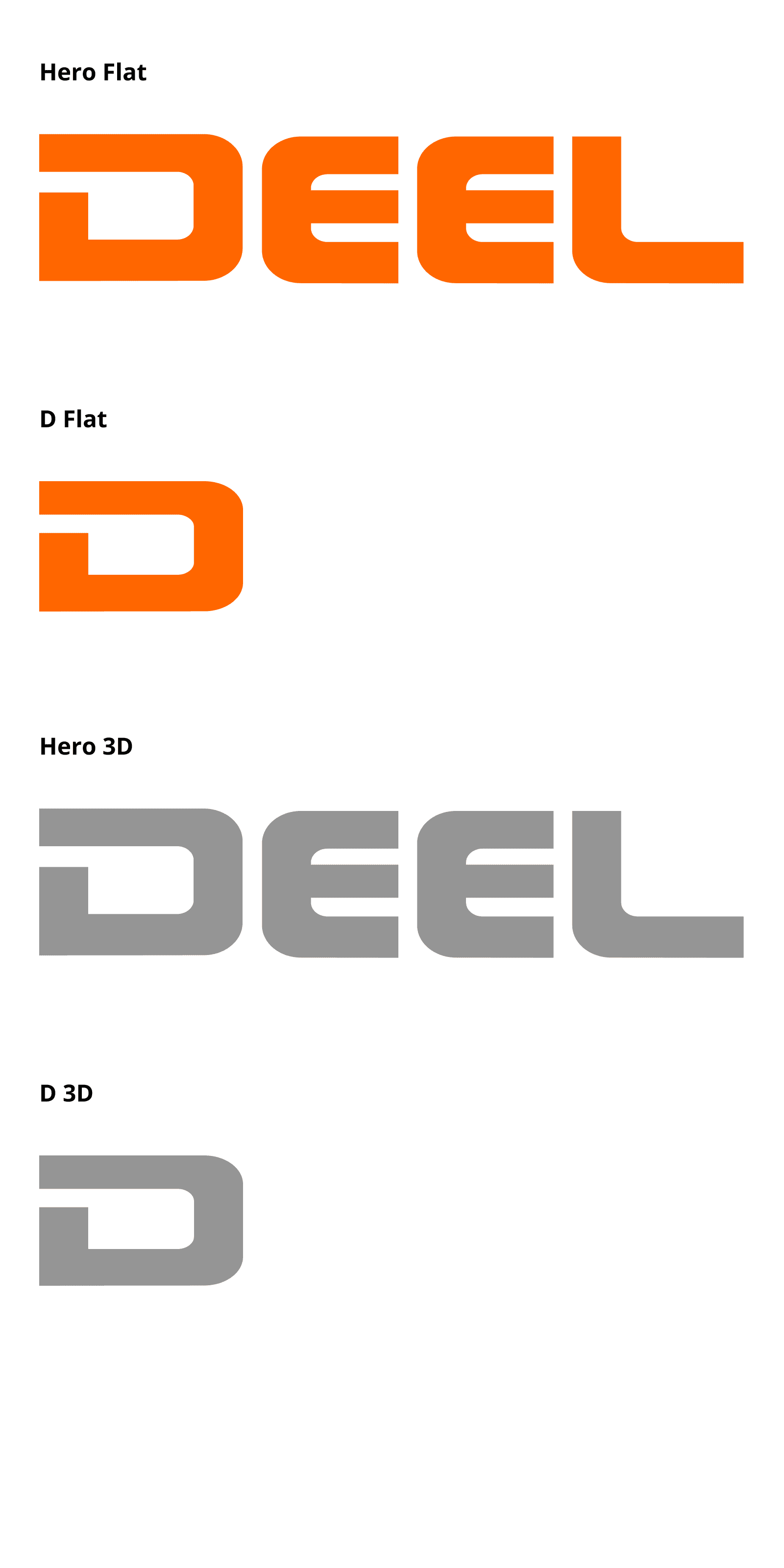
Using the proper logo for the right application is key. We have four logo variants. The full color logos should be used where possible. All logos have specific sizing rules that help maintain readability. Please familiarize yourself with each version.
HERO FLAT
This variant is the default and appropriate for use in most situations.
D FLAT
This variant can be used for an icon or in spaces too small for the full logo.
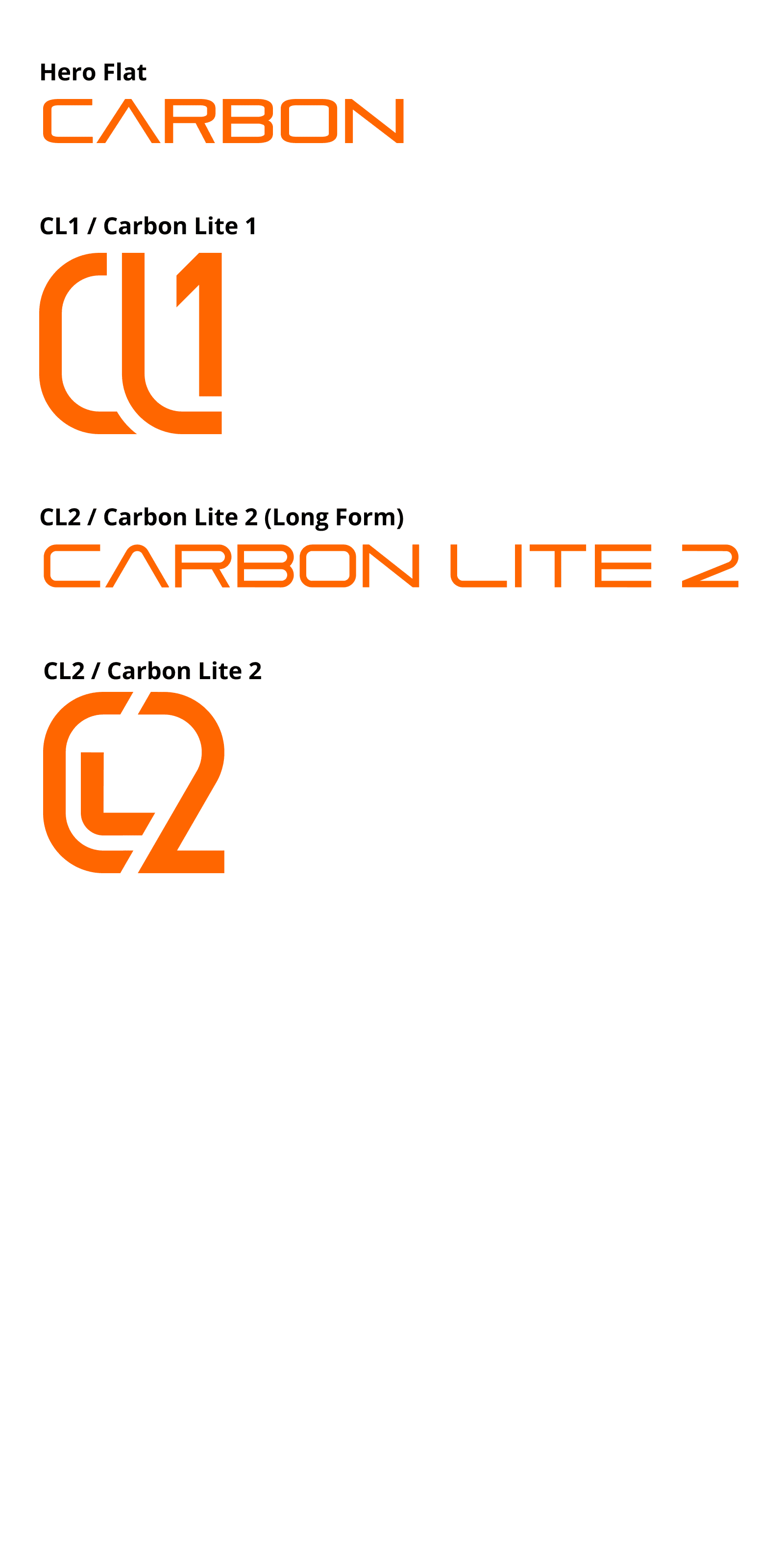
Product Logos
Orange is the primary color for all product logos.
Orange is the primary color for all product logos.
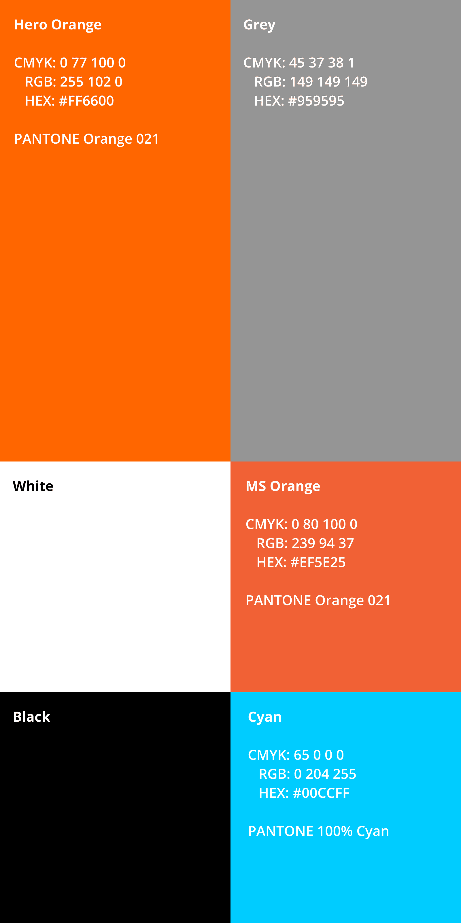
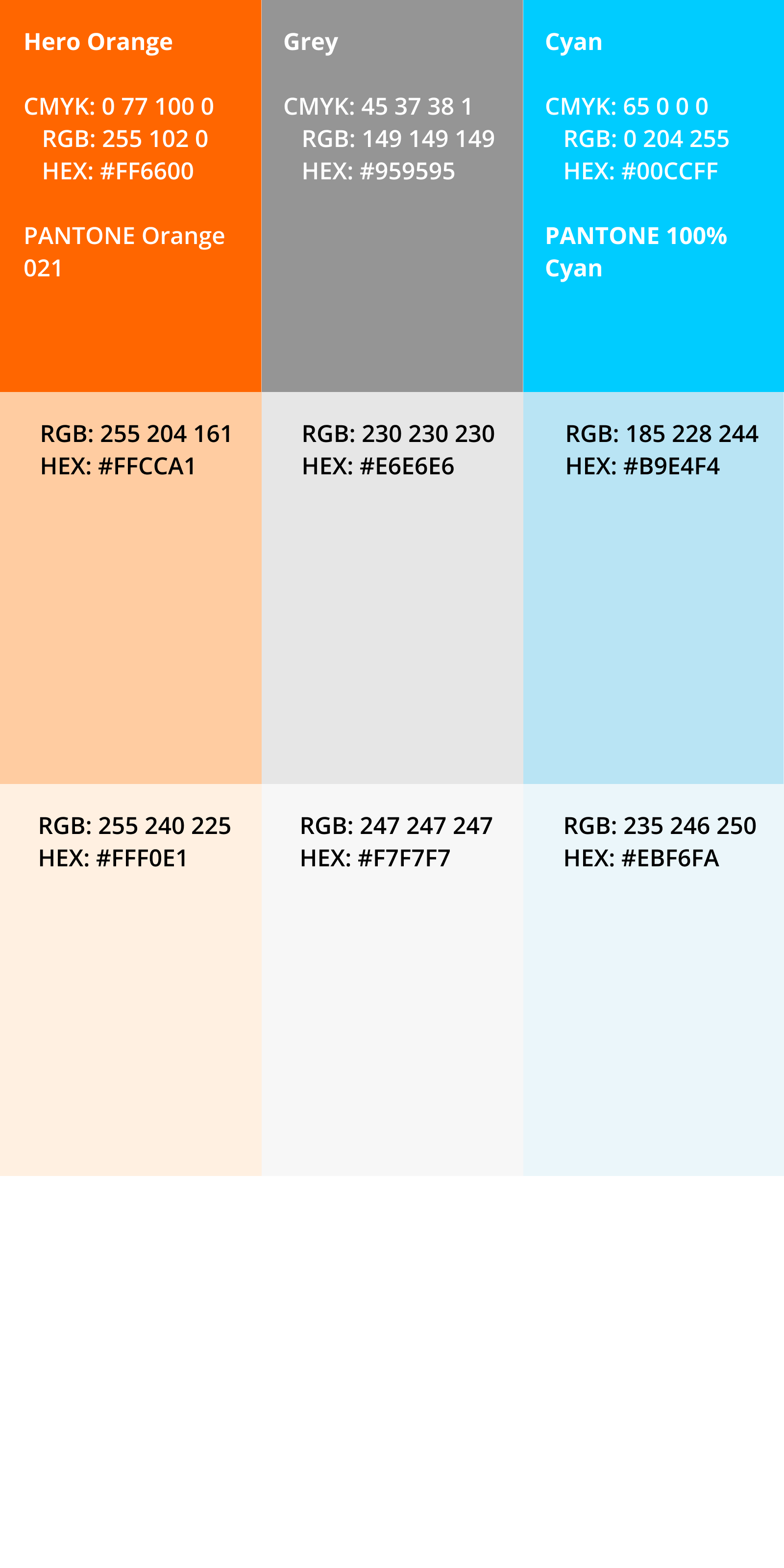
Color Palette
See individual templates for correct usage of colors in email, documentation and presentation.
MS Orange is used only for increase legibility in smaller type. It is not for use as a background color.
Cyan is an accent color only. Use sparingly for the back side of printed materials and apparel. Do not use for a background in presentation or signage.
No gradients are to be used in any instance.
Extended Web Color Palette
The extended web color palette should only be used in web and digital situations.
Colors should be used as hover and active states as well as accents.
The extended web color palette should only be used in web and digital situations.
Colors should be used as hover and active states as well as accents.
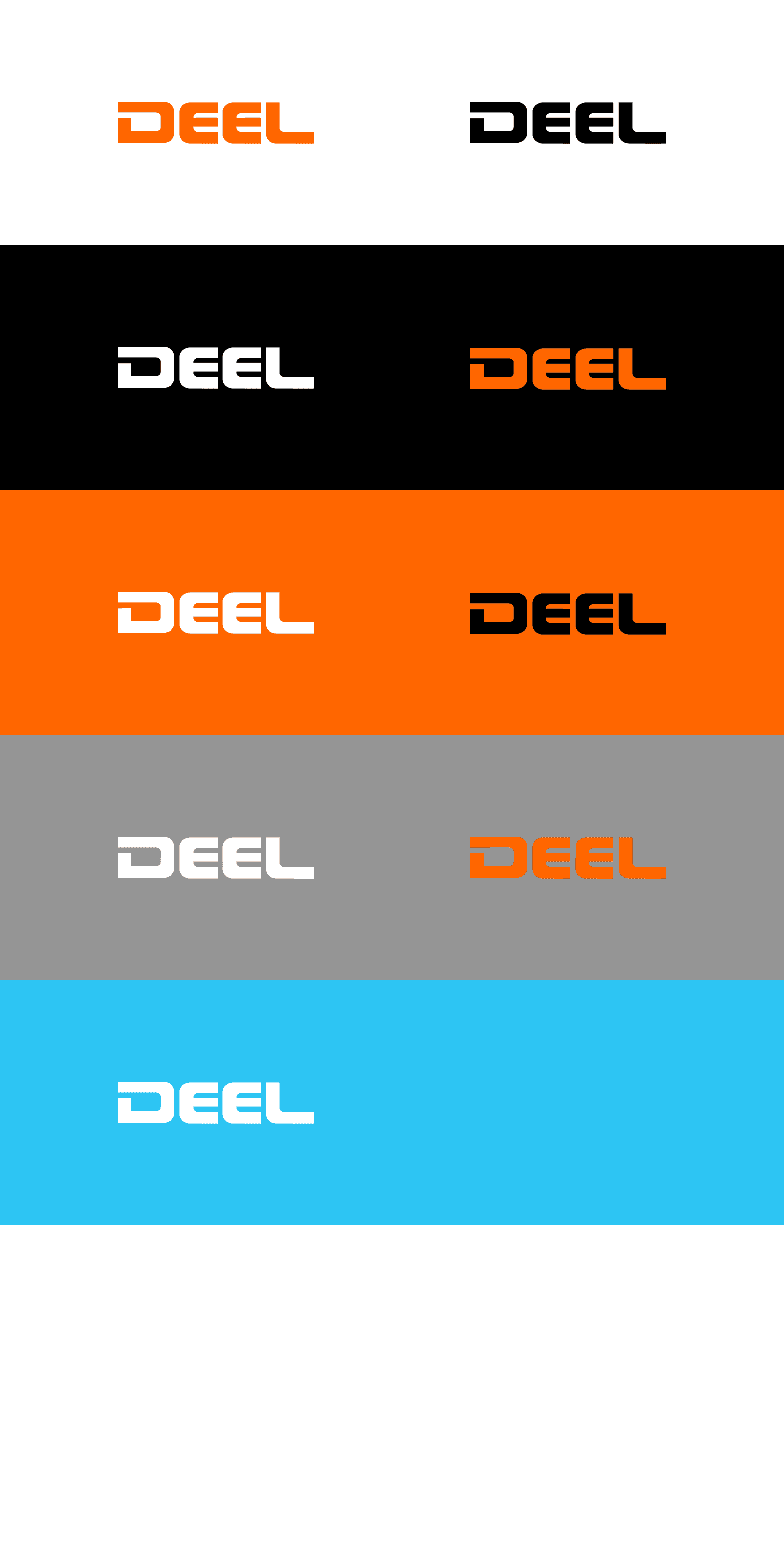
Color Modes
The logo must always be easy to distinguish from the background. Orange is the primary brand color. Use alternate color modes in the order of preference.
Background Colors
WHITE
Use for any electronic or printed documentation and email. Do not use for presentations or signage.
BLACK
Use for for presentations and signage.
ORANGE
Use for for presentations and signage.
GREY
Use only the white logo sparingly in printed materials. Orange logo is appropriate for branded apparel.
CYAN Use only on the back side of printed material or for branded apparel.
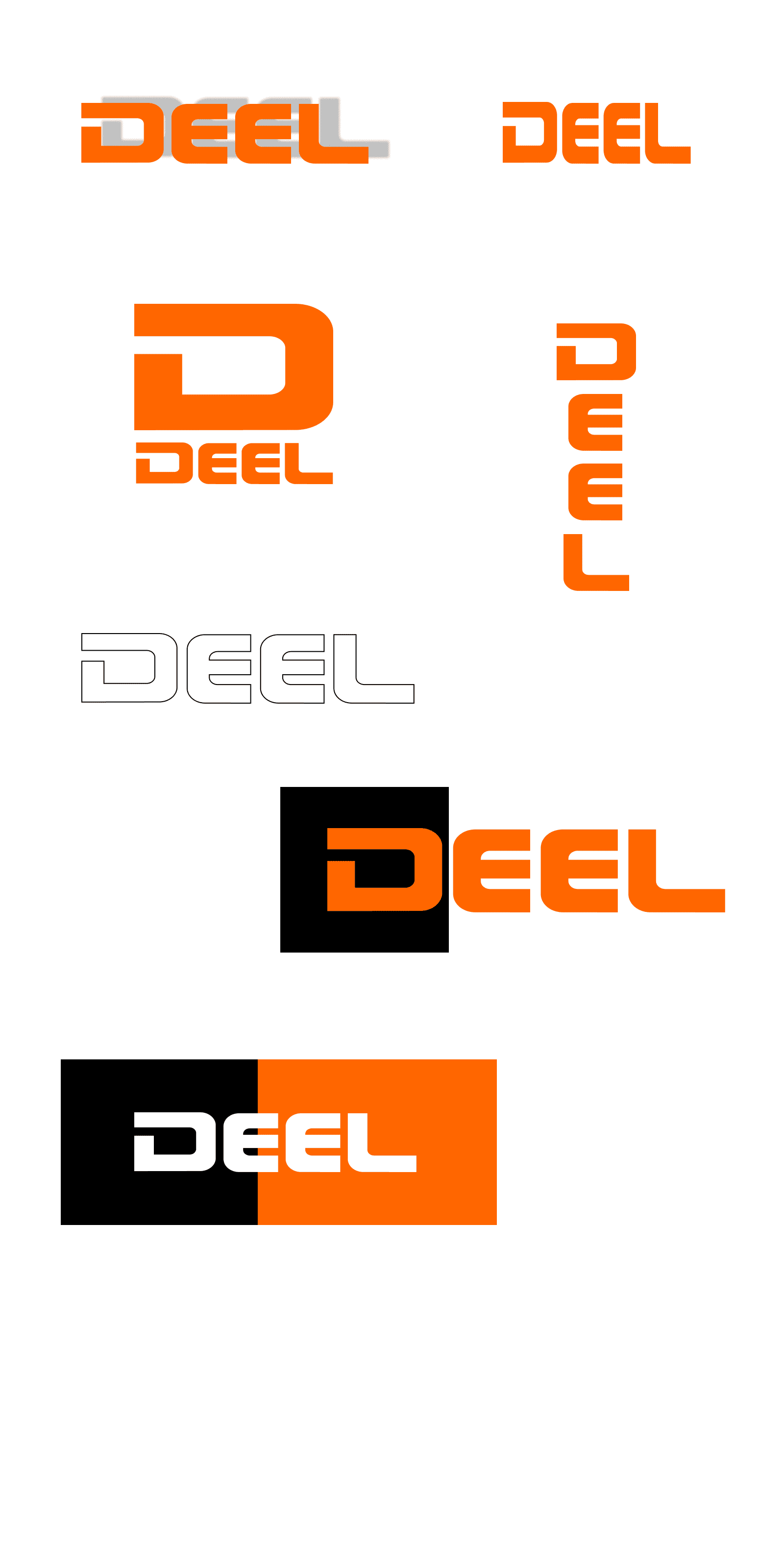
Incorrect Usage
To ensure the logo is clearly visible, avoid the following mistakes.
Do not add drop shadows.
Do not distort.
Do not use the Hero and D logos together.
Do not create a stacked version of the logo.
Do not add outlines.
Do not place on top of details in other branding elements.
The logo must only be placed on a solid color or photograph.
Do not straddle different background colors or sections.
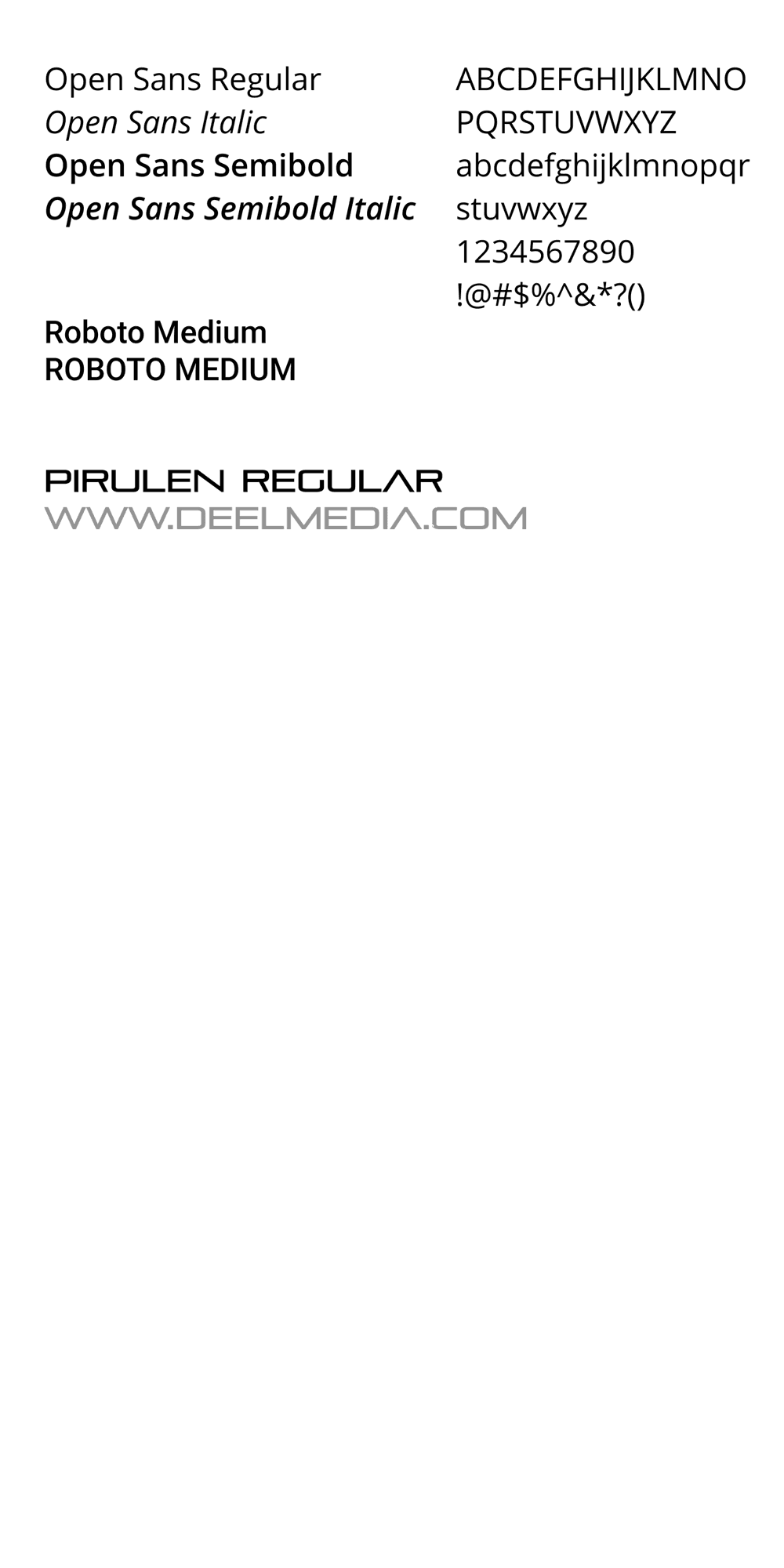
Typography
Opens Sans and its general weights are used for all body text in documentation, printed materials and presentations. It is highly legible and already installed on most devices.
Roboto Medium is used for multiple levels of headings in documentation, printed materials and presentations. Color and ALL CAPS can be used for differentiation. The style complements to logo design.
Pirulen Regular may be used in conjunction with Carbon, Carbon Lite or the CL1 and Cl2 logos for packaging and interfaces only.
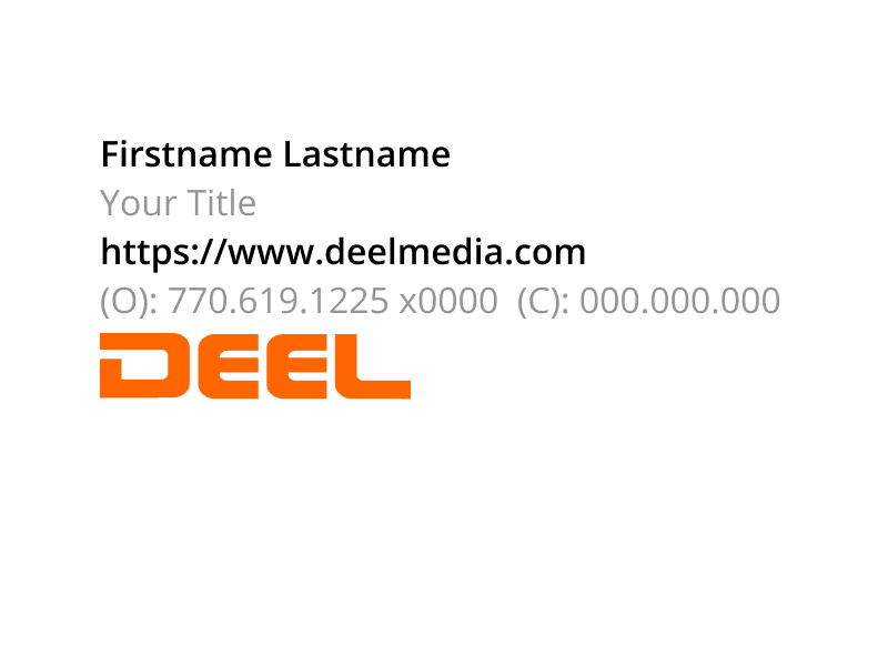
Email Signature
The logo signature is Calibri 11pt or the default email font. Name field should be semibold.
Follow the example here.
The logo signature is Calibri 11pt or the default email font. Name field should be semibold.
Follow the example here.